
HTML:
Sicher ankommen. Gut anlegen. Schön bleiben.
Hafeninformationen
Alles Wichtige rund um Anreise, Gastliegeplätze, Infrastruktur und Notfallkontakte im SCNW.
Adresse
Segelclub Neusiedl West
SCNW Seegelände 7 7100 Neusiedl am See
So finden Sie uns
Anreise zum Hafen
Der SCNW ist mit dem Auto bequem erreichbar. Geben Sie in Google Maps einfach „SCNW Segelclub Neusiedl West“ ein – dann werden Sie direkt zum Clubgelände geführt.
Am Club sind ausreichend Parkplätze vorhanden. Zusätzlich gibt es eigene Parkplätze für Gäste unserer Mitglieder .
Mit dem Auto
A4 Ostautobahn, Abfahrt Neusiedl am See, Richtung See / Hafen / Strandbad.
Mit Bahn & Taxi
Bis Bahnhof Neusiedl am See. Von dort weiter mit Taxi, Fahrrad oder zu Fuß.
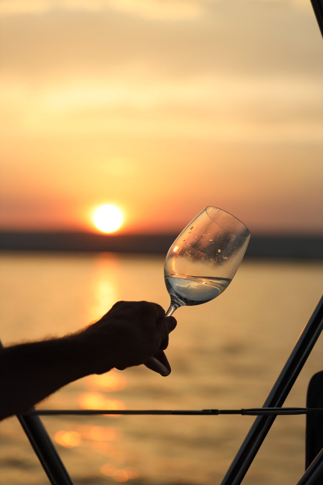
Gastfreundschaft am Wasser
Gastliegeplätze
Gastsegler:innen willkommen
Gastliegeplätze befinden sich im Hafenbereich des SCNW. Bitte melden Sie sich vor dem Anlegen bei Anton Kern oder einem anderen Vorstandsmitglied.
Kontakt Gastliegeplätze
Anton Kern 0664 390 01 61
Vor Ort
Wir helfen gerne bei der Orientierung im Hafen und bei Fragen zu Liegeplatz, Clubgelände und Infrastruktur.
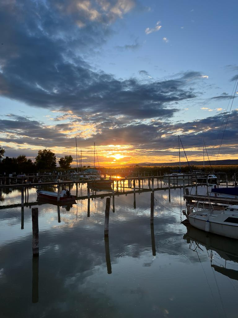
Rund um den SCNW
Alles fußläufig erreichbar
Der SCNW liegt ideal am See. In wenigen Minuten erreichen Sie zu Fuß beliebte Lokale und Angebote rund um den Hafen.
Mole West
TaKeria
Eisladen
Strandbad Neusiedl am See
Promenade und Spazierwege am See
Infrastruktur
Was Sie im Hafen finden
Clubhaus Treffpunkt für Mitglieder, Gäste und Veranstaltungen.
Terrasse Direkt am Wasser mit Blick auf Hafen und See.
Sanitäranlagen Für Mitglieder und Gäste im Clubbereich.
Parkplätze Ausreichend Parkmöglichkeiten direkt beim Club.
Im Notfall
Wichtige Notrufnummern
Standort für Einsatzkräfte: SCNW, Seegelände 7, 7100 Neusiedl am See
Euro-Notruf 112
Feuerwehr 122
Polizei 133
Rettung 144
Wasserrettung 144
Ärztefunkdienst 141
Apothekennotdienst 1455
Vergiftungszentrale 01 406 43 43
SCNW erleben
Sie möchten den Club kennenlernen?
Besuchen Sie uns im Hafen, lernen Sie unsere Mitglieder kennen oder informieren Sie sich über eine Mitgliedschaft beim SCNW.
Mitglied werden
CSS:
/* SCNW Hafeninformationen */
.ha-page{
font-family:’Manrope‘,system-ui,-apple-system,BlinkMacSystemFont,“Segoe UI“,sans-serif;
color:#061a38;
background:#fff;
overflow:hidden;
}
.ha-page *{
box-sizing:border-box;
}
.ha-hero{
position:relative;
min-height:680px;
display:grid;
align-items:center;
padding:110px clamp(28px,6vw,130px) 150px;
background:
linear-gradient(90deg,rgba(6,26,56,.86) 0%,rgba(6,26,56,.68) 38%,rgba(6,26,56,.28) 72%,rgba(6,26,56,.08) 100%),
var(–ha-hero-image);
background-size:cover;
background-position:center;
}
.ha-hero:after{
content:““;
position:absolute;
z-index:2;
left:-5vw;
right:-5vw;
bottom:-62px;
height:124px;
background:#fff;
border-radius:50% 50% 0 0 / 56% 56% 0 0;
}
.ha-hero-inner{
position:relative;
z-index:5;
width:min(850px,100%);
}
.ha-kicker,
.ha-label{
display:block;
font-family:’Caveat‘,cursive;
color:#d71920;
font-size:clamp(30px,4vw,52px);
font-weight:700;
line-height:1;
margin-bottom:12px;
}
.ha-hero h1{
margin:0 0 20px;
color:#fff;
font-size:clamp(54px,7.2vw,96px);
line-height:.9;
letter-spacing:-.06em;
font-weight:900;
text-shadow:0 14px 50px rgba(6,26,56,.45);
max-width:860px;
overflow-wrap:normal;
word-break:normal;
hyphens:none;
}
.ha-hero p{
max-width:650px;
margin:0;
color:rgba(255,255,255,.92);
font-size:clamp(19px,2vw,26px);
line-height:1.45;
font-weight:600;
}
.ha-actions{
display:flex;
flex-wrap:wrap;
gap:14px;
margin-top:34px;
}
.ha-btn{
display:inline-flex;
align-items:center;
justify-content:center;
min-height:54px;
min-width:150px;
padding:15px 28px;
border-radius:999px;
font-weight:900;
line-height:1.15;
text-align:center;
white-space:nowrap;
text-decoration:none !important;
transition:.25s ease;
}
.ha-btn-red{
background:#d71920;
color:#fff !important;
box-shadow:0 16px 34px rgba(215,25,32,.28);
}
.ha-btn-red:hover{
transform:translateY(-2px);
background:#b91319;
}
.ha-btn-light{
background:rgba(255,255,255,.94);
color:#061a38 !important;
}
.ha-btn-light:hover{
transform:translateY(-2px);
background:#fff;
}
.ha-main{
position:relative;
z-index:5;
}
.ha-intro{
width:min(1180px,calc(100% – 44px));
margin:-34px auto 70px;
padding:34px;
display:grid;
grid-template-columns:1.4fr .8fr;
gap:28px;
align-items:center;
background:#fff;
border-radius:26px;
box-shadow:0 24px 70px rgba(6,26,56,.13);
}
.ha-intro h2,
.ha-section h2{
margin:0 0 16px;
color:#061a38;
font-size:clamp(34px,4.2vw,62px);
line-height:1;
letter-spacing:-.045em;
font-weight:900;
}
.ha-intro p,
.ha-section p{
margin:0 0 16px;
color:#40516a;
font-size:18px;
line-height:1.7;
}
.ha-map-card{
padding:26px;
border-radius:22px;
background:#f3f7fb;
border:1px solid rgba(6,26,56,.08);
}
.ha-map-card h3{
margin:0 0 10px;
font-size:24px;
font-weight:900;
}
.ha-map-card strong{
display:block;
margin:12px 0 18px;
color:#061a38;
font-size:20px;
}
.ha-small-link{
color:#d71920 !important;
font-weight:900;
text-decoration:none !important;
}
.ha-section{
width:min(1180px,calc(100% – 44px));
margin:0 auto 90px;
}
.ha-split{
display:grid;
grid-template-columns:1fr 1fr;
gap:56px;
align-items:center;
}
.ha-image-wrap{
position:relative;
overflow:hidden;
border-radius:34px;
min-height:420px;
box-shadow:0 24px 70px rgba(6,26,56,.16);
}
.ha-image-wrap img{
width:100%;
height:100%;
min-height:420px;
object-fit:cover;
display:block;
}
.ha-info-grid{
display:grid;
grid-template-columns:1fr 1fr;
gap:18px;
margin-top:28px;
}
.ha-info-grid div{
padding:24px;
border-radius:22px;
background:#f3f7fb;
}
.ha-info-grid h3,
.ha-card h3,
.ha-contact-list h3{
margin:0 0 10px;
color:#061a38;
font-size:22px;
font-weight:900;
}
.ha-cards-section{
text-align:center;
}
.ha-cards-section .ha-label{
margin-left:auto;
margin-right:auto;
}
.ha-cards{
display:grid;
grid-template-columns:repeat(3,1fr);
gap:22px;
margin-top:30px;
text-align:left;
}
.ha-cards-four{
grid-template-columns:repeat(4,1fr);
}
.ha-card{
padding:28px;
border-radius:26px;
background:#fff;
border:1px solid rgba(6,26,56,.1);
box-shadow:0 18px 48px rgba(6,26,56,.08);
}
.ha-card p{
margin:0;
font-size:17px;
}
.ha-card a{
color:#d71920 !important;
font-weight:900;
text-decoration:none !important;
}
.ha-list{
margin:24px 0 0;
padding:0;
list-style:none;
display:grid;
gap:12px;
}
.ha-list li{
position:relative;
padding-left:30px;
color:#061a38;
font-size:18px;
font-weight:800;
}
.ha-list li:before{
content:““;
position:absolute;
left:0;
top:.55em;
width:12px;
height:12px;
border-radius:50%;
background:#d71920;
}
.ha-emergency{
padding:46px;
border-radius:34px;
background:#061a38;
color:#fff;
box-shadow:0 24px 70px rgba(6,26,56,.18);
margin-bottom:90px;
}
.ha-emergency h2,
.ha-emergency h3{
color:#fff;
}
.ha-emergency p{
color:rgba(255,255,255,.82);
}
.ha-emergency-grid{
display:grid;
grid-template-columns:repeat(4,1fr);
gap:16px;
margin-top:30px;
}
.ha-emergency-grid div{
padding:22px;
border-radius:22px;
background:rgba(255,255,255,.08);
border:1px solid rgba(255,255,255,.12);
}
.ha-emergency-grid span{
display:block;
color:rgba(255,255,255,.72);
font-size:14px;
font-weight:800;
margin-bottom:8px;
}
.ha-emergency-grid strong{
display:block;
color:#fff;
font-size:28px;
font-weight:900;
letter-spacing:-.03em;
}
.ha-contact-list{
margin-top:28px;
padding:26px;
border-radius:24px;
background:rgba(255,255,255,.08);
}
.ha-contact-list p{
margin:0 0 8px;
}
@media (max-width:980px){
.ha-intro,
.ha-split,
.ha-cards,
.ha-cards-four,
.ha-emergency-grid{
grid-template-columns:1fr;
}
.ha-split-reverse .ha-image-wrap{
order:2;
}
}
@media (max-width:640px){
.ha-hero{
min-height:620px;
padding:90px 22px 130px;
}
.ha-hero h1{
font-size:clamp(48px,14vw,72px);
}
.ha-actions{
flex-direction:column;
align-items:flex-start;
}
.ha-btn{
width:100%;
}
.ha-intro,
.ha-section{
width:calc(100% – 28px);
}
.ha-intro,
.ha-emergency{
padding:24px;
border-radius:24px;
}
.ha-info-grid{
grid-template-columns:1fr;
}
.ha-image-wrap,
.ha-image-wrap img{
min-height:320px;
}
.ha-emergency-grid strong{
font-size:24px;
}
}
.ha-final{
display:flex;
justify-content:space-between;
align-items:center;
gap:30px;
padding:40px;
border-radius:34px;
background:#f3f7fb;
margin-bottom:80px;
}
.ha-final p{
margin-bottom:0;
max-width:720px;
}
@media (max-width:980px){
.ha-final{
flex-direction:column;
align-items:flex-start;
}
}
@media (max-width:640px){
.ha-final{
padding:24px;
border-radius:24px;
}
}